5 Things Every Website Needs
Your website is not only your business’s digital billboard, it is your welcome mat. Your website gives visitors the details on what services or products you provide, how it is going to solve a concern or problem they have, and how they get started. It increases your credibility, and it should be a lead generating or product selling machine. According to Donald Miller at Business Made Simple, there are five things that every website should have. He recommends a (1) clear header, a (2) clear solution to the customer’s problem, a (3) lead generator, a (4) three-step plan to get started, and an (5) easy way to place an order or request your service.
1. Clear Header
The most important thing for your website to have is a clear header. It should include what your business offers, how you will make the customer’s life better, and what the customer needs to do to buy your product. When creating a clear header for your business’s website, don’t assume the customer knows anything about your product. Make your header clear and concise. It should also include a strong “call to action” button for the visitor to get started.
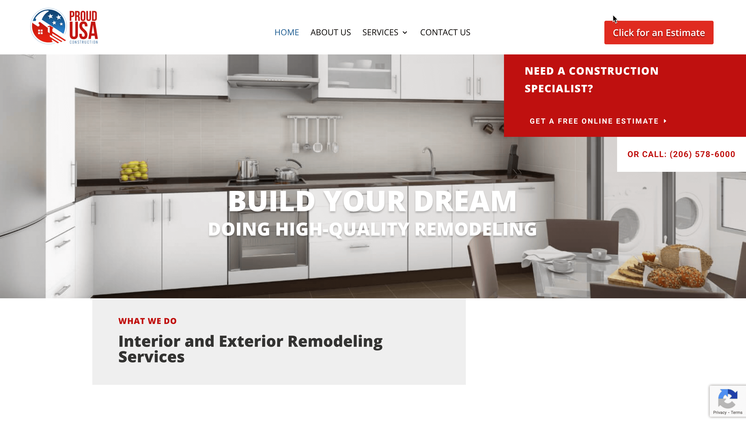
One example of a strong header is on ProudUSAConstruction.com. Their header says “Build Your Dream Home – Doing High-Quality Remodeling,” and it shows precisely what they do and what their business offers. “Building Your Dream Home” shows how they will make the customer’s life better. They have a very obvious call to action button in red in the top right hand corner to show what the customer has to do to start the process of hiring Proud USA Construction.

2. Talk About The Customers’ Problems
Additionally, your website needs to emphasize your customers’ problems and offer a clear solution to solve those problems. It should talk about your customers’ needs often and plainly show the ways your product solves those needs. Starting with the problem and positioning the solution afterwards will make your product or service more appealing to the customer’s needs.
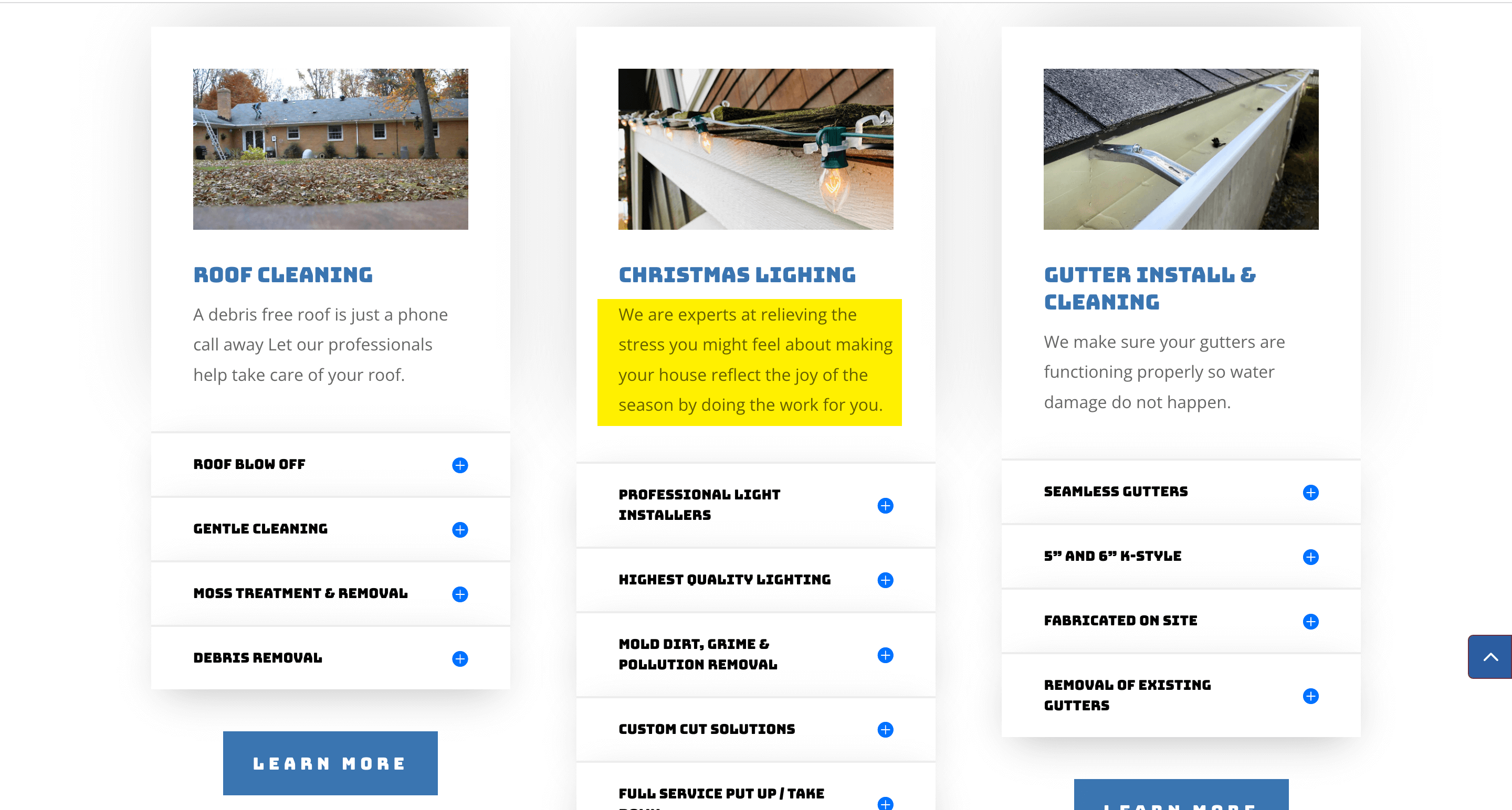
For example, at AllAboutService.Services, their homepage lists each one of their services and how those services solve their customers’ problems. Under the “Christmas Lighting” section, they position the customers’ problem of the stress to Christmas Lighting installation and how they will solve those problems.

3. Advertise Your Lead Generator
If your website does not have a lead generator, it needs one! A lead generator is a way to get the contact information of an interested customer. It should spark the customer’s interest enough that they are eager to give out their contact information. Your website should have ad space that promotes your lead generator and includes an attention grabbing pop-up or colored area that is prominently featured. One website that utilizes pop-ups is ShahzamFactor.com. The homepage includes an immediate place for customers to subscribe to the recurring Newsletter.

4. Include A Three-Step Plan
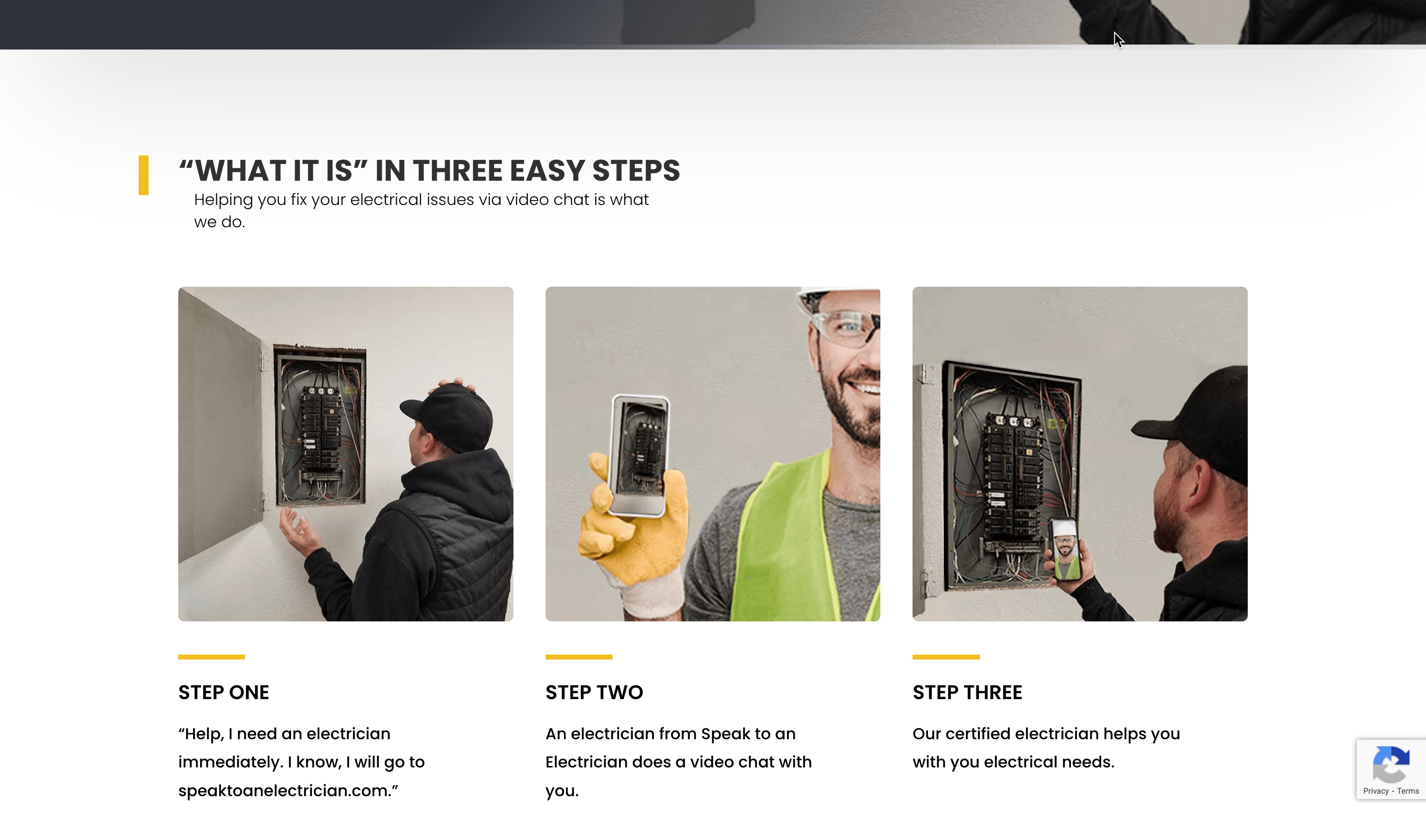
Your customers may never make a move towards your product or service if they don’t understand the process. Making a simple three-step plan for customers to start the process of using your product or service. This three-step plan should have a title and be straightforward and concise. For
example, SpeakToAnElectrician.com has a simple three-step plan on their homepage with a title and a call to action button. The customers know what to do and how to get started.

5. Make It Easy To Get Started
It is important to include an easy way to place an order or get started with a service or consultation on your website. Including frequent call to action buttons that are consistent all over your website will move your visitors towards becoming customers.
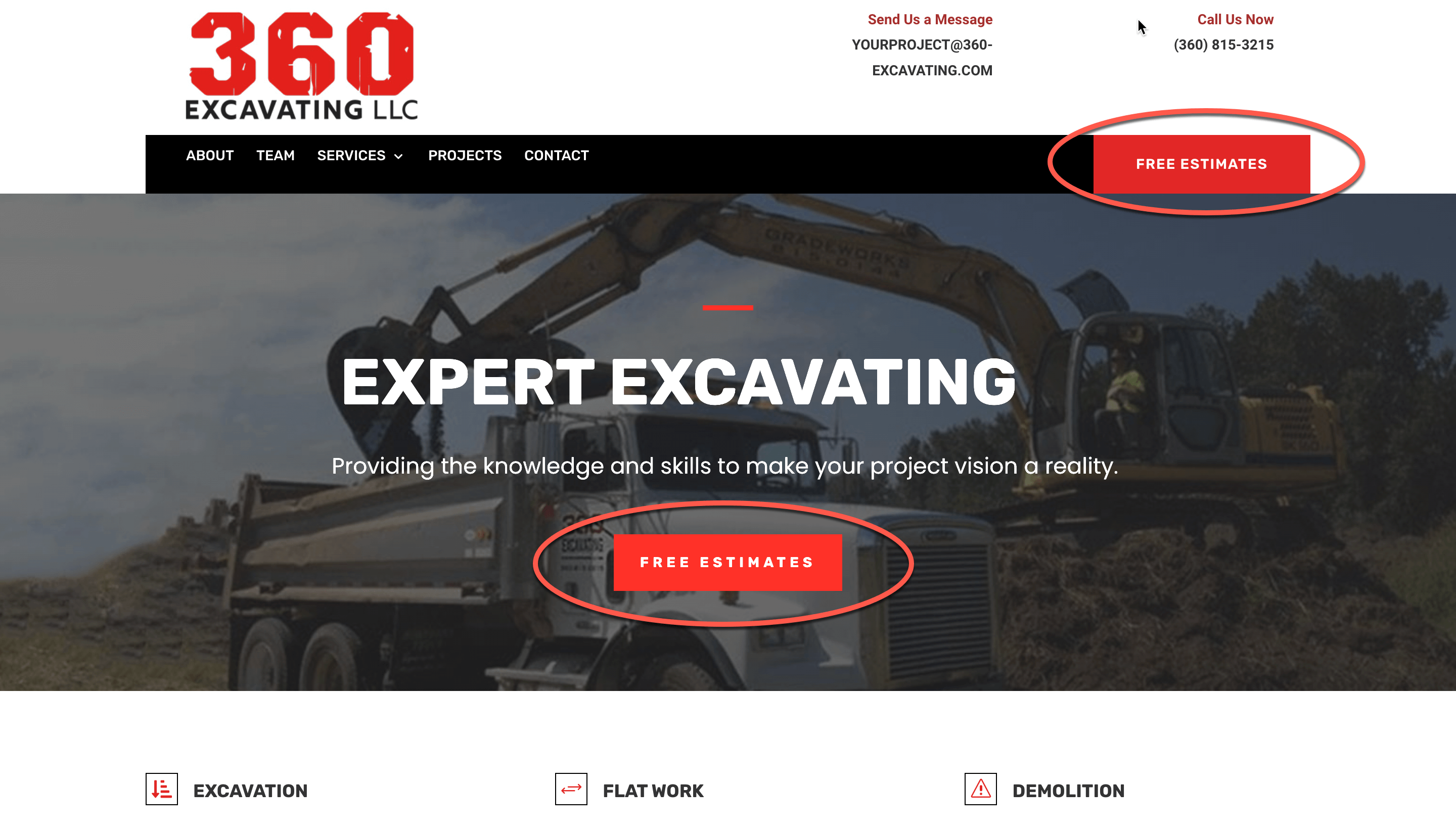
This call to action button should be in a color that stands out and is obvious to your visitor. Take 360-Excavating.com for example. This website has a “Free Estimate” button in red consistently throughout the whole website.

A great looking business website that does not convert visitors to leads or customers is incomplete. A functional site that drives awareness and revenue to your business is important to you, and that’s why it’s important to us. At Local View, we strive to implement these five steps in designing your website. We want to make the most out of your online presence.


